Flat Scale
- Jun 6, 2017
- 3 min read

As you have no doubt noted by now, much of my work, independent of subject matter, reads as relatively FLAT. Things are shot from an aerial perspective, planes are missing, or pop up in the "wrong" place, and a strong preference for objects in isolation, or wall to wall detail. This is not accidental by any means.
Accordingly, a couple of questions arise concerning this persistence of plane simplification, plane removal, and its relationship to genre in the work:
1- Where does this preference come from?
2- What are the visual goals of this approach?
3- How does this potentially open up the work conceptually?
The answer to the first question is pre-photographic, but also scientific. The pre-photographic part of this relates to growing up in New York and going on school trips to the museums. Somewhere in there, I started liking work that was abstract, but also graphically simplified like Matisse, Mondrian and the Abstract Expressionists. From the first time I saw the Matisse paper cuts, they just knocked me out. I also feel that way about Broadway Boogie Woogie by Mondrian.

The other issue relating to this preference for flatness, and a high level of detail, is a very strong interest in the natural sciences dating back to my earliest memories, that persists to this very moment. Scientific photography is all about classification, clarification, detail and/or specimen. This is photography masquerading as a data point. The goal here is answering a question, and clarification, not aestheticizing your subject in any way. For those who want a good visual reference, the botanical photos of Karl Blossfeldt make strong use of this approach, as do almost any microscopic slide.

Between these two early influences, long before I even picked up a camera in my late teens, the flatness was almost preordained in my photography. By the time I saw the graphically minimal work of Weston, and Man Ray's conceptual still lifes, the flatness not only defined the graphics of my work, but also became a primary tool in working symbolically and conceptually. It allowed for the removal, distortion, or modification of space, confusion concerning scale, and the removal of common items from their usual or expected function or situation.
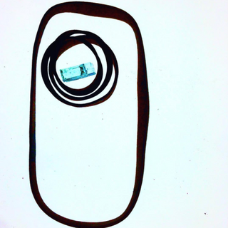
CYCLOPS HEAT DEATH #3 THE BOLTS
The three photos above clearly demonstrate how this graphically simplified approach can be applied across genre lines relatively easily. However, another concern here is the ability to illustrate a concept within seconds. The Cyclops photo immediately above does this, using two old rubber bands, one piece of safety glass and a pale green background. The graphic simplification really allows for the ability to produce symbols on demand, with the only limits being, having the appropriate props, and my given free association skills on a given Wednesday or Friday. This simplified system essentially allows for a sort of modularity in the work once genre and concept have been identified.
However, the issues around genre have barely been addressed yet. Both the Cyclops, and the Bolts above stay inside their expected genre structure; a still life and a detail photo. Not so for Heat Death #3 or the triptych which opens this post. This gross simplification generates two interesting avenues into concept:
1- Confusion concerning scale
2- Genre language
The issue of not being able to scale something is immediately apparent when photographed or dropped into nothing, but negative space. Short of having an actual ruler in an image, we have no idea of the actual dimensions of an object in such an image. Our sense of scale is just so tethered to the actual world, or having an item interact with something it is usually associated with. The triptych above strongly makes use of this approach. The three photos appear to be actual landscapes when in fact they are each about three inches across. Hence we have created a landscape that is not a landscape. The mere presence of a horizon line is enough to begin to convince the viewer they are looking at a hillside covered in snow against a stormy sky. Conversely, in Heat Death #3, we have a landscape photo depicted inside the language of macrophotography. There is no sense of depth, everything is sharp, and the usual horizon line so commonly found in landscape photos is nowhere to be seen. We are looking at a wall of trees with no sense of just how extensive this fire damage is. The image more or less poses a question rather than answering one. Merely by switching genre structure we have moved from the representational to the conceptual.


Comments